Overview
The second most common question I receive when teaching is "Should I learn to code?" surpassed only by "How do I learn how to code?".
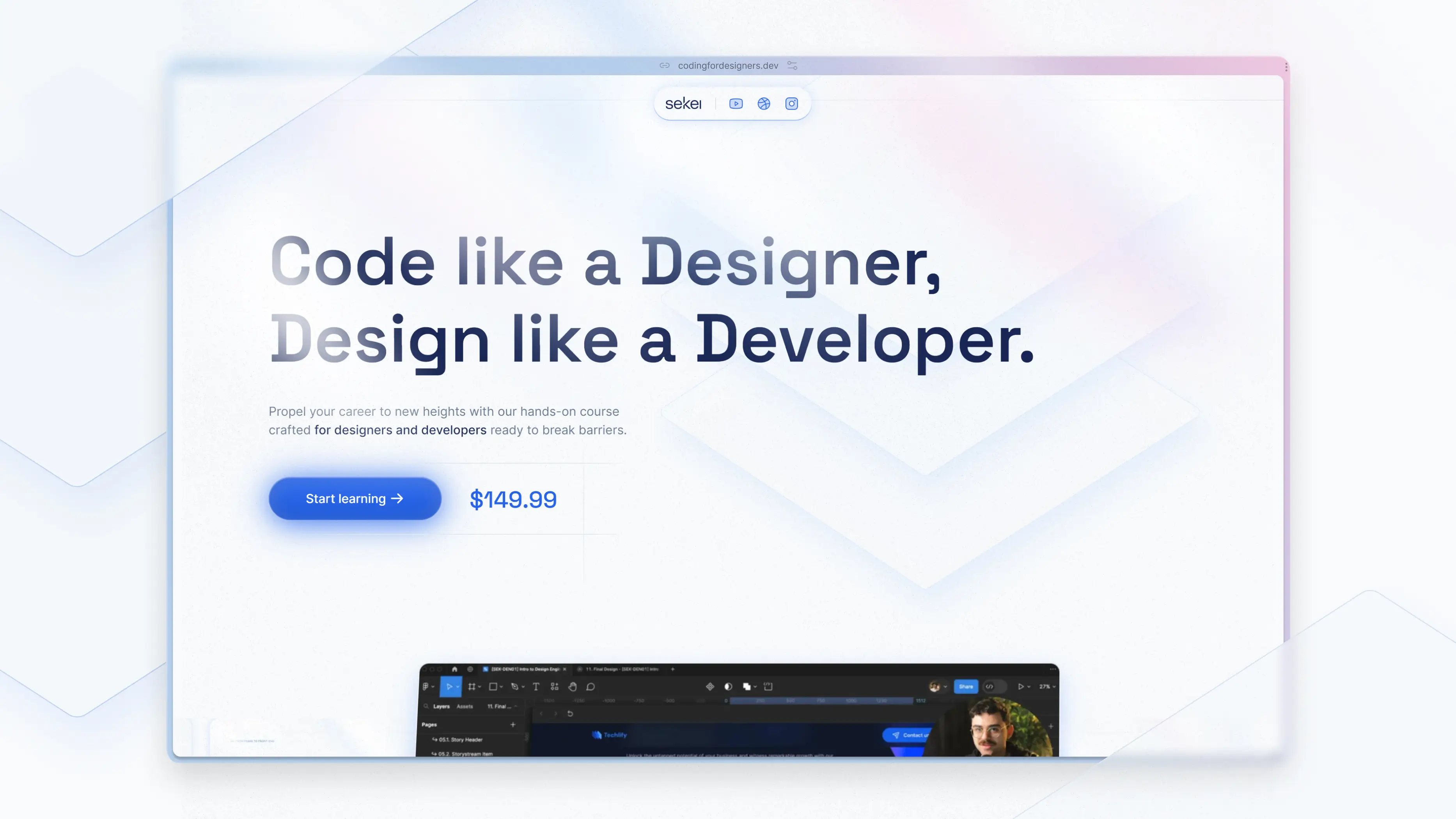
As a Design Engineer, and evangelist of this type of function in product teams, I wanted to help designers all over the world learn how to code, with a practical course that cuts out all the fluff and gets designers building exactly what matters to them: front-end Uls.
My answer became Intro to Coding for Designers, a first look at coding from the unique perspective of designers.
To help me reach my goal of teaching 1,000 designers to code in 2024, I enlisted the help of Denny Buck, an incredibly talented Product Designer. Together we researched, designed, and built a beautiful landing page that adds legitimacy to the brand, while clearly outlining the value users can expect when they enroll.
Problem & Goals
One of the main goals of the landing page was to educate designers about all of the value this course delivers, and tying that back to their own career and personal advancement.
It was critical to package it all up in a way that would appeal visually and emotionally to our target audience of designers looking to improve their skillset, communications with developers, and increase their chances of landing a role.
Personas, Moodboarding and Lo-Fi
We moved quickly through the early stages, identifying persona archetypes, and using the empathy we developed to analyze the landscape and moodboard the types of web products we thought best aligned with our goals.
We then jumped into low fidelity ideation, which was a critical step in ensuring we were aligned in our vision for the page, and helped us iterate and nail the story we were going to tell our users.
Foundations & Components
As we continued to move into higher fidelity stages of design, we relied heavily on Tailwind as the foundations for the site's visual language. This helped us move fast while we worked on a mighty tight 3-week timeline, as I juggled finalizing the course content, and Denny continued leading the charge in materializing our vision for the landing page.
It also helped us maintain visual consistency across all the various touch points: starting from the marketing site, through to the course content, all the way to the actual practical projects students build.
A somewhat robust, but never limiting, set of components helped us transition the designs over to Framer, where we continued to iterate into higher and higher levels of refinement.
HI-FI & Build
I urged Denny to jump right into Framer as early as possible in the process, ensuring that we continued moving fast and efficiently, rather than designing every last detail in Figma, only to have to make compromises or deal with implementation quirks.
The launch window was critical, as we targeted a release before the holidays to take advantage of the market's spending habits coupled with the end of year L&D budgets resetting.
Denny jumped into Framer, converting the already high-quality Figma designs into pixel perfect, responsive designs in Framer. We also focused on sprinkling little touches of visual and interaction candy through the page to appeal to designers' creative nature, while supporting the story we tried to tell.
Impact
In its first month, the site garnered just under 3,000 pageviews, and generated a little over $8,000 in revenue.
Most importantly though, it helped my business present a clear call to action and value proposition that I can share with my community across all of my socials.
As the Sekei content brand continues to grow, the Coding for Designers landing page is a central pillar to keeping my business sustainable in years to come, and sets me up beautifully for future iterations and sequels to this introductory course!


